Table of Contents
Scrapbooking is an art form that extends beyond preserving memories; it’s a medium for storytelling and creative expression. One often underestimated aspect of scrapbooking is the use of color. Color choices can profoundly impact the emotional resonance of a scrapbook layout. In this article, we will explore the fascinating world of color psychology in scrapbooking and how it can be harnessed to evoke emotions and enhance the narrative power of your pages.
Scrapbooking is indeed a versatile art form and its true magic lies not just in preserving memories, but in weaving captivating stories and unleashing your creativity. One facet of scrapbooking that deserves more attention is the artful selection and application of color. Color is a potent tool that can elicit profound emotional responses and elevate your scrapbook from a mere collection of images to a compelling narrative that tugs at the heartstrings.
The Psychology of Color: Colors have the remarkable ability to evoke feelings and convey messages without the need for words. Whether it’s the warmth of a vibrant red, the tranquility of a soft blue or the playfulness of a bright yellow, each color carries its unique emotional associations. Understanding color psychology allows you to harness these associations to enhance the impact of your scrapbook.
Setting the Mood: Think of color as the backdrop to your scrapbook’s story. The hues you choose set the tone and mood for each page or spread. Want to convey the nostalgia of a cherished family vacation? Earthy tones and soft pastels might be the way to go. If you’re celebrating a joyous occasion, such as a birthday or wedding, vibrant and celebratory colors can capture the festive spirit.
Creating Visual Harmony: Beyond emotions, color plays a crucial role in the visual harmony of your scrapbook. It can guide the viewer’s eye, highlight focal points and create a sense of cohesion throughout the pages. The careful balance of complementary and contrasting colors can add depth and interest to your layouts.
Personalized Expression: Your choice of colors is a reflection of your personal style and the story you want to tell. The colors you select can be a subtle way to convey your personality or the personalities of those you’re documenting. Whether you prefer a monochromatic elegance or a riot of bold and contrasting colors, your scrapbook’s color palette becomes an extension of your creative expression.
Emotionally Connecting: Perhaps the most powerful aspect of using color in scrapbooking is its ability to emotionally connect with the viewer. When someone flips through your scrapbook, the colors can transport them into the moment, triggering memories and emotions associated with that time. It’s a silent yet profound way to communicate the essence of each memory.
In this article, we will delve deeper into the world of color psychology in scrapbooking. We’ll explore various color schemes, their emotional connotations and how to effectively apply them to your layouts. By understanding the psychology of color and mastering its use, you can breathe life into your scrapbook pages, making them not just visually appealing but emotionally resonant and ensuring that your stories are not only seen but deeply felt.
Should you desire more in-depth information, it’s available for your perusal on this page: 2020 #12 Topic Introduction: Typography – PaperArtsy
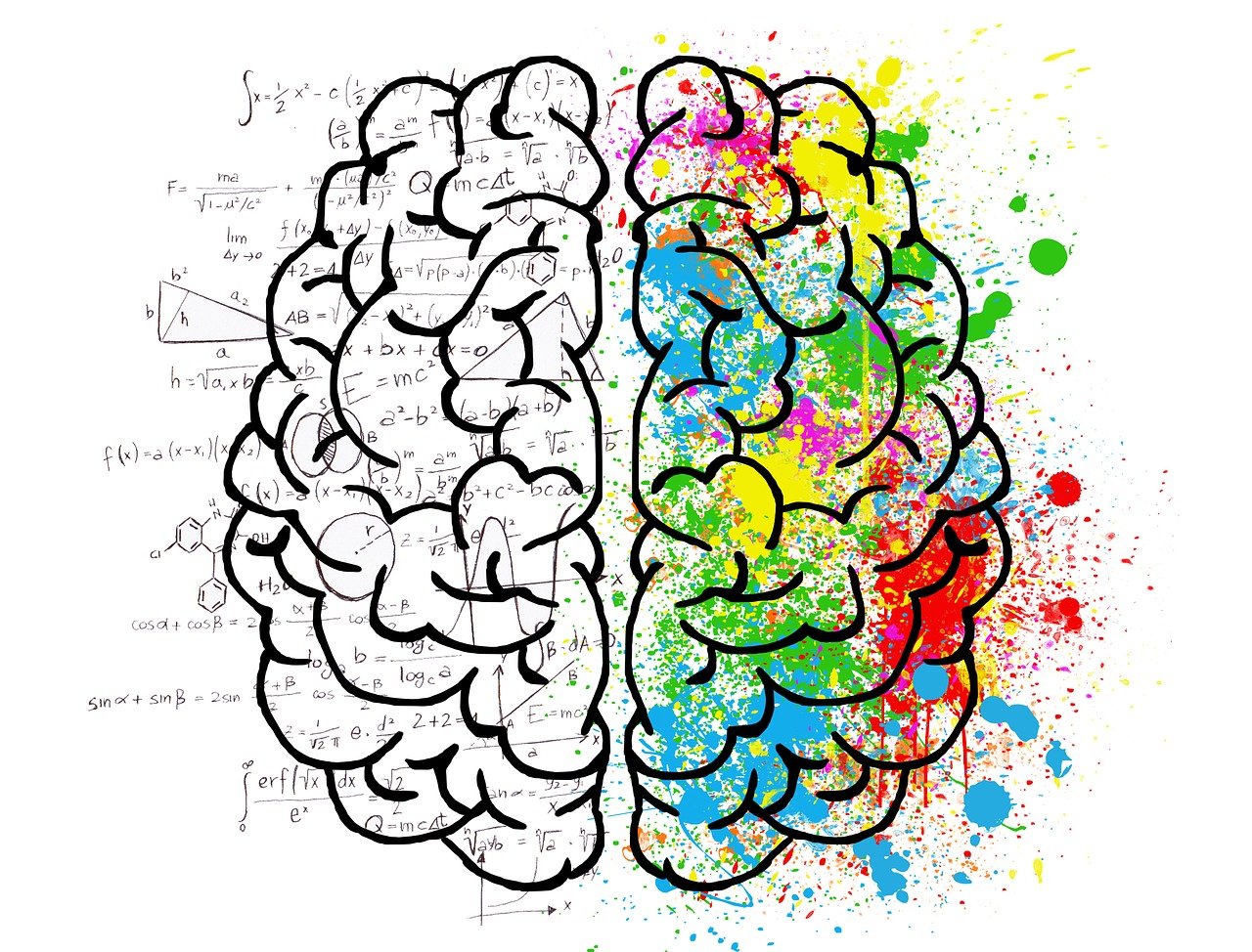
Understanding Color Psychology
Color psychology is the study of how colors affect human behavior, emotions and perceptions. It’s a powerful tool that advertisers, designers and artists have used for decades to convey specific messages or elicit particular emotions. By applying color psychology principles to scrapbooking, you can create layouts that not only look visually appealing but also resonate emotionally with the viewers.
Certainly! Here’s an extended idea:
“Color psychology, a fascinating field of study, delves into the intricate ways colors can influence human behavior, emotions and perceptions. It’s a tool that has been harnessed by advertisers, designers, artists and even therapists for decades to convey messages, evoke emotions and shape experiences. When applied thoughtfully to scrapbooking, color psychology can elevate your layouts to a whole new level, transforming them into powerful visual narratives that resonate deeply with both creators and viewers alike.
Every color has its own unique personality and emotional associations. For instance, warm colors like red and yellow often convey feelings of energy, passion and warmth, while cooler shades like blue and green can evoke calmness, serenity and tranquility. Understanding these associations can help you choose colors that align with the mood and message you want to convey in your scrapbook.
Consider the theme and content of your scrapbook. If it’s a celebration of a joyous occasion like a birthday, you might want to incorporate vibrant, cheerful colors to reflect the happiness of the moment. Alternatively, if you’re documenting a serene vacation, softer, more calming colors could create a sense of tranquility and nostalgia.
Incorporating color psychology can also enhance the storytelling aspect of your scrapbook. For example, if you’re sharing a story of resilience and growth, using a progression of colors from dark to light can symbolize the journey from hardship to triumph.
Furthermore, pay attention to color harmony and contrast. Complementary colors can create dynamic visual interest, while analogous colors offer a sense of cohesion and unity. Experiment with different color schemes to see what resonates most with your project’s message and emotions.
Lastly, remember that color psychology is not a strict rule but a guideline. Personal preferences and cultural influences can also impact how people perceive colors. Therefore, feel free to trust your intuition and instincts when selecting colors for your scrapbooking projects. Ultimately, the goal is to create layouts that not only please the eye but also engage the heart, inviting viewers to connect with the stories and emotions you’ve carefully woven into your scrapbook pages.”
For a comprehensive look at this subject, we invite you to read more on this dedicated page: A Provider’s Guide to Brief Cognitive Behavioral Therapy
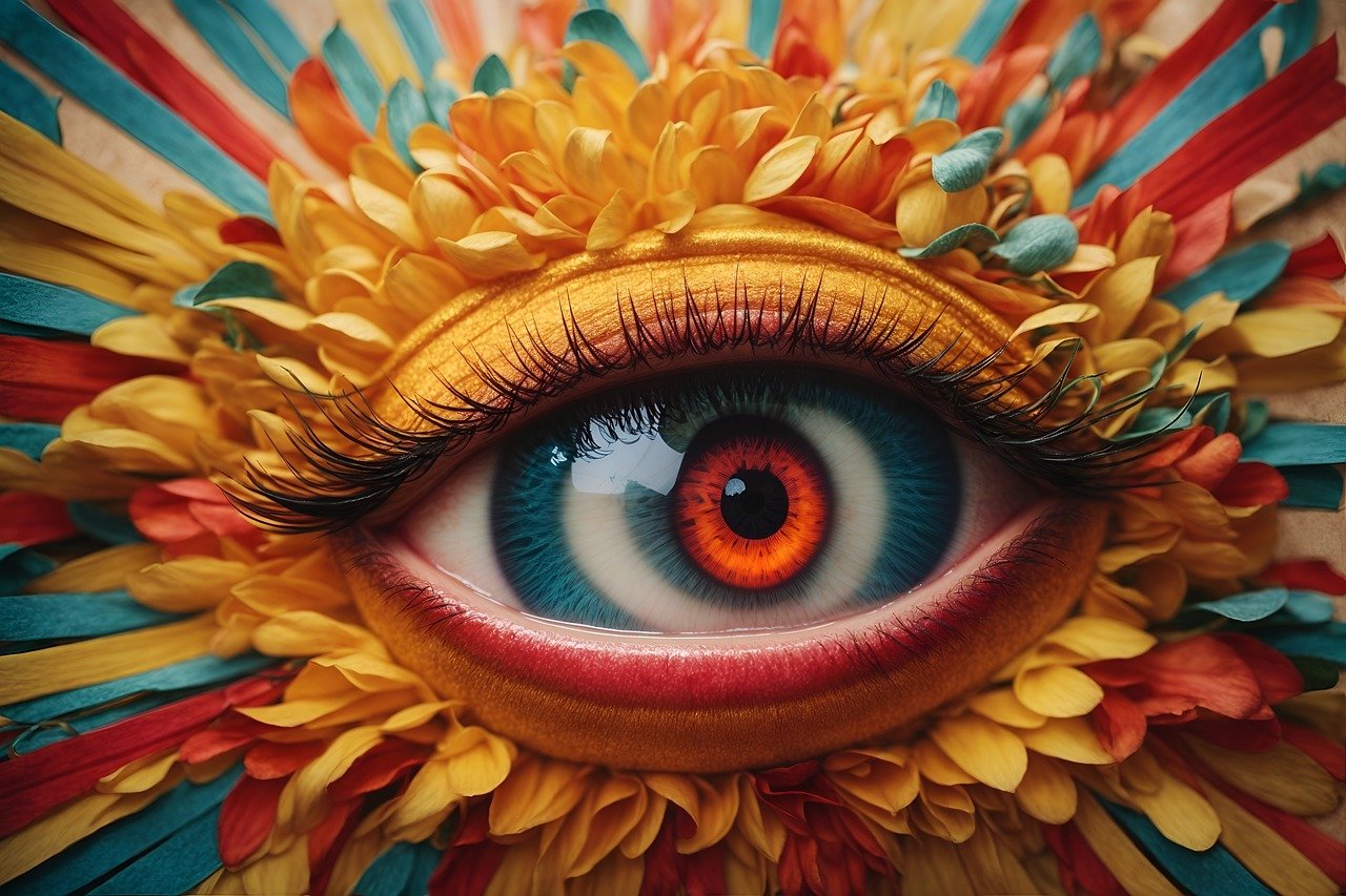
The Emotional Palette
Colors are known to evoke a wide range of emotions and associations. Here are some common emotions associated with different colors:
Colors are a remarkable and versatile tool in the world of scrapbooking and design. They have the incredible ability to convey emotions, set moods and evoke memories, making them a powerful element in your creative toolbox. Here, we delve into some common emotions and associations linked to different colors, offering insights into how you can use color psychology to enhance your scrapbook layouts:
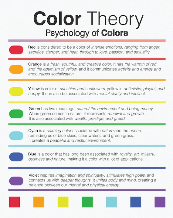
**1. Red: Red is a color of passion, energy and warmth. It’s often associated with love, excitement and intensity. In your scrapbooking, red can be used to highlight memorable moments of love, celebration or any event where emotions run high. It can add a dynamic and vibrant touch to your pages.
**2. Blue: Blue embodies serenity, tranquility and a sense of calm. It’s often linked to feelings of trust, dependability and reliability. Incorporating blue into your layouts can be ideal for reflecting peaceful moments, serendipitous experiences or themes of stability and security.
**3. Green: Green symbolizes growth, renewal and nature. It’s strongly connected to feelings of harmony, balance and freshness. Use green to capture memories of outdoor adventures, new beginnings or any moments where a connection with nature plays a role.
**4. Yellow: Yellow radiates positivity, joy and optimism. It’s the color of sunshine and happiness. When you want to convey moments of laughter, happiness or a sunny disposition, yellow can be the perfect choice to infuse your layouts with a bright and cheerful vibe.
**5. Purple: Purple exudes creativity, spirituality and a touch of mystery. It often represents imagination, introspection and luxury. Utilize purple when commemorating artistic endeavors, moments of deep thought or themes of elegance and luxury.
**6. Orange: Orange is energetic, lively and enthusiastic. It’s a color that sparks enthusiasm and creativity. In your scrapbooks, orange can add zest to pages that celebrate achievements, creative breakthroughs or vibrant gatherings with friends and family.
**7. Pink: Pink represents affection, tenderness and nurturing. It’s often associated with love and sweetness. Use pink to convey moments of love, affection or the joy of nurturing relationships, making it ideal for pages about family, friendship and love.
**8. Brown: Brown signifies stability, reliability and earthiness. It’s often linked to a sense of groundedness and security. Incorporate brown into your layouts when you want to evoke feelings of tradition, comfort or moments that exude a sense of home and hearth.
**9. Black: Black is sophisticated, elegant and timeless. It can be used to add drama and contrast to your pages. While often associated with formality and mystery, it can also be used to emphasize the significance of an event or to create visually striking layouts.
**10. White: White represents purity, simplicity and clarity. It’s often associated with a sense of new beginnings and fresh starts. In scrapbooking, white can be used to create clean and minimalist designs that draw attention to the purity and simplicity of a moment.
**11. Gray: Gray is a neutral and versatile color that can complement other colors beautifully. It’s often linked to feelings of balance and sophistication. In your layouts, gray can serve as a backdrop that allows other colors and elements to shine.
Remember that color associations can vary between individuals and cultures and the emotions tied to colors can be nuanced. So, as you explore the world of color in scrapbooking, consider the specific emotions and associations that resonate with your memories and the stories you want to tell. By carefully selecting and combining colors, you can enhance the emotional impact of your layouts and create scrapbooks that not only preserve memories but also evoke feelings and sentiments that are deeply meaningful to you and your loved ones.
Explore this link for a more extensive examination of the topic: Emotion-Based Classification and Indexing for Wallpaper and Textile
Theme and Mood Matching
Consider the theme and mood of your scrapbook page. Choose colors that align with the emotions you want to convey. For instance, use warm, vibrant colors for joyful occasions like birthdays and soft, cool tones for serene moments like a day at the beach.
“When curating your scrapbook page, pay thoughtful attention to the theme and desired mood. Delve into a spectrum of colors that resonate with the emotions you aim to express. For moments of joy, opt for warm, vibrant hues that exude energy and excitement—perfect for celebrations like birthdays. Conversely, for tranquil scenes like a day at the beach, embrace soft, cool tones that mirror the calm and serenity of those peaceful moments, letting the colors tell a story within your scrapbook.”
Should you desire more in-depth information, it’s available for your perusal on this page: The Psychology of Fonts (Fonts That Evoke Emotion) | Envato Tuts+

Contrast and Balance
Experiment with contrasting colors to draw attention to key elements on your page. A pop of color against a neutral background can create a visually striking effect. Balance is crucial to ensure that the colors harmonize and don’t overwhelm.
Experimenting with contrasting colors is like wielding a paintbrush on the canvas of your scrapbook pages, creating dynamic visual narratives that captivate the viewer’s eye and emotions. This technique, when used skillfully, can be a powerful storytelling tool in your scrapbooking arsenal.
1. Guiding the Eye: Contrasting colors serve as arrows, guiding the viewer’s gaze to the most important elements on your page. A vibrant red or electric blue against a muted backdrop can lead the eye precisely where you want it to go, ensuring that your story unfolds in the intended sequence.
2. Highlighting Emotions: When you want to highlight specific emotions within a memory, contrasting colors can be your voice. For instance, in a layout celebrating a joyful family reunion, a burst of sunny yellow can accentuate the laughter and happiness shared during that day.
3. Dramatic Impact: The use of contrasting colors adds drama and intensity to your pages. It’s like turning up the volume on a significant moment. For a striking effect, experiment with complementary colors, such as blue and orange or purple and yellow, to create a visual tension that demands attention.
4. Symbolism and Themes: Contrasting colors can be used symbolically to emphasize themes within your scrapbook. For instance, if your layout revolves around the idea of transformation or change, contrasting colors can represent the contrast between the past and the present, highlighting the journey of growth.
5. Mood Shifting: Colors have the remarkable ability to shift the mood of a layout. A shift from warm, earthy tones to cool, serene colors can evoke a sense of transition or transformation in your story, allowing you to visually convey the narrative’s emotional arc.
However, it’s essential to strike a balance when employing contrasting colors. While they can create impactful visual statements, they should complement the overall theme and mood of your scrapbook. An overload of contrasting colors may lead to visual chaos and distract from the core message. Therefore, maintaining harmony and cohesion within your color scheme is crucial to ensure that your scrapbook remains visually engaging and emotionally resonant.
In conclusion, contrasting colors are a versatile and potent tool in scrapbooking. They can breathe life into your memories, emphasize the emotions of the moment and guide the viewer through your narrative. When wielded thoughtfully and with balance, they elevate your scrapbook pages from mere collections of photos to captivating visual stories that leave a lasting impression. So, don’t hesitate to experiment with contrasting colors as you craft your next scrapbooking masterpiece and watch as your stories come to life in vibrant, vivid hues.
If you’d like to dive deeper into this subject, there’s more to discover on this page: Children’s Contact With Their Incarcerated Parents – PMC
Texture and Depth
Different shades and tones of the same color can add depth and dimension to your layouts. This can be particularly effective in vintage or heritage-themed scrapbooks, where muted tones evoke a sense of nostalgia.
Exploring the nuances of color within a single hue is like unlocking a hidden dimension of creativity in your scrapbooking endeavors. Let’s delve deeper into how different shades and tones of the same color can breathe life into your layouts, especially when crafting vintage or heritage-themed scrapbooks:
1. Tonal Harmony: Using various shades and tones of the same color creates a harmonious visual experience. It’s like listening to a soothing melody where each note seamlessly blends with the next. This harmony in your color palette adds a sense of unity and cohesion to your layouts.
2. Layered Depth: Just as an artist uses shadows and highlights to create depth in a painting, different shades of a color can add a layered dimension to your scrapbook pages. For instance, a pale blue background paired with slightly darker blue embellishments can mimic the depth of a vintage photograph.
3. Subtle Elegance: Muted tones within a single color family exude an air of timeless elegance. It’s a classic choice that never goes out of style, making it perfect for heritage-themed scrapbooks where you aim to capture the enduring beauty of the past.
4. Nostalgic Allure: Vintage and heritage themes often evoke a sense of nostalgia and muted colors play a pivotal role in conveying this emotion. Soft, faded hues transport viewers to a bygone era, triggering memories and emotions associated with the past.
5. Highlighting Details: When you use different shades of the same color, you can strategically highlight certain elements on your page. For instance, a slightly darker shade can draw attention to a key photograph or journaling block, while lighter tones create a backdrop that lets these details shine.
6. Versatile Storytelling: The versatility of using various shades of a color allows you to adapt your storytelling to different themes or moods. Whether you’re crafting a vintage romance layout, a heritage family tree or a nostalgic travel adventure, your chosen color palette can set the tone.
7. Monochromatic Elegance: Monochromatic scrapbooking, where you primarily use one color in various shades, is a powerful technique. It’s simplicity at its finest, allowing you to focus on the story and details without distraction from a multitude of colors.
8. Color Psychology: Different shades within a color family can convey subtle psychological cues. For example, blues may evoke calm and tranquility, while deeper burgundies may exude warmth and comfort. Consider the emotional impact you want your layouts to have when selecting your color palette.
9. Timeless Appeal: Just as black and white photography stands the test of time, so does a color palette of varying tones within a single hue. Your vintage or heritage-themed layouts will remain visually appealing, even as design trends come and go.
10. Personal Touch: Experiment with different shades and tones to find the perfect color story that resonates with your personal style and the specific memories you’re documenting. It’s an artistic journey that allows you to infuse your unique touch into each layout.
Incorporating different shades and tones of the same color is a subtle yet powerful technique in scrapbooking. It’s a creative choice that adds depth, dimension and a touch of nostalgia to your layouts, making them not just beautiful but also emotionally resonant. So, the next time you embark on a vintage or heritage-themed scrapbooking project, consider the rich tapestry of colors within a single hue and let your creative vision shine through.
Don’t stop here; you can continue your exploration by following this link for more details: A Provider’s Guide to Brief Cognitive Behavioral Therapy
Color for Journaling
Choose colors for journaling that reflect the emotions or thoughts you want to convey. For instance, use calming blues for reflections on peaceful moments or vibrant reds for passionate anecdotes.
Selecting colors for your journaling in scrapbooking is akin to adding another layer of emotional depth to your pages. It’s a subtle yet powerful way to convey the feelings and sentiments behind your memories. Here’s why choosing the right colors for journaling matters and how it can enhance the storytelling aspect of your scrapbook:
Emotional Resonance: Colors have an innate ability to evoke emotions and set the mood. When you choose colors that align with the emotions or thoughts you want to convey, you’re enhancing the emotional resonance of your journaling. Calming blues can evoke serenity and introspection, while vibrant reds infuse passion and energy into your anecdotes.
Visual Impact: Different colors command different levels of attention. For instance, bold and bright colors like yellow or orange can grab the viewer’s eye, while muted or pastel shades like soft pink or lavender create a gentle, soothing effect. Consider the visual impact you want your journaling to have on the overall composition of your page.
Theme and Storytelling: Your choice of colors can reinforce the theme of your scrapbook page and the narrative you’re sharing. If you’re documenting a serene day at the beach, the use of sandy beige and oceanic blues can transport the viewer to that peaceful setting. On the other hand, fiery oranges and yellows may align with a scrapbook page capturing an exciting adventure.
Personalization: Journaling is a deeply personal aspect of scrapbooking and color choices add a layer of personalization. By selecting colors that resonate with your own feelings and memories, you’re infusing a piece of your personality into your pages. It’s a way of making your scrapbook authentically “you.”
Contrast and Readability: Think about contrast and readability when choosing journaling colors. Ensure that your text stands out against the background. For instance, if you have a dark background, white or light-colored text may offer better readability. Conversely, on a light background, dark text is often more legible.
Color Psychology: Delve into color psychology to gain a deeper understanding of the emotions associated with different colors. This knowledge can guide your color choices. For example, green may represent growth and harmony, while purple might signify creativity and mystery.
Consistency and Cohesion: Maintaining consistency in your color choices throughout your scrapbook can create a cohesive visual narrative. This doesn’t mean using the same colors for every journaling entry, but rather selecting a palette that harmonizes with your overall theme.
Experimentation: Don’t be afraid to experiment with color combinations. Sometimes unexpected pairings can create striking effects. Use a color wheel or color palette tools to explore complementary or analogous color schemes that resonate with your storytelling.
Incorporating thoughtful color choices into your journaling elevates your scrapbooking from a collection of photos to a rich tapestry of emotions and stories. It’s a creative journey where every color selection becomes a brushstroke on the canvas of your memories, adding depth, mood and personal significance to your cherished scrapbook pages.
You can also read more about this here: A Provider’s Guide to Brief Cognitive Behavioral Therapy

Emphasize the Story
Highlight important parts of your story by using color to direct the viewer’s attention. Make use of color psychology to underscore the emotional impact of the narrative.
Highlighting important parts of your story through strategic color use is an artful way to engage your audience and convey the emotional depth of your narrative. By leveraging color psychology, you can underscore the emotional impact of the story you’re telling in your scrapbook. Here’s how this technique can elevate your storytelling:
Emotional Resonance: Colors have the power to evoke emotions and set the mood. Whether you want to convey happiness, nostalgia, excitement or calmness, selecting the right color palette can instantly resonate with your audience’s emotions. For instance, warm colors like reds and yellows can exude energy and enthusiasm, while cooler tones like blues and greens can evoke a sense of tranquility.
Visual Hierarchy: Color can be a tool for creating a visual hierarchy in your scrapbook layouts. By using a dominant color to draw attention to key elements such as photos, headlines or important details, you guide the viewer’s eye to where you want them to focus. This ensures that the narrative flows smoothly and that vital aspects of the story don’t go unnoticed.
Contrast and Impact: A splash of contrasting color can make certain elements pop and grab the viewer’s attention. For example, using a bold, contrasting color for captions or quotes can emphasize their significance in the narrative. It’s a visual technique that adds impact and memorability to your scrapbook pages.
Consistency and Themes: Consistency in color choices can tie your scrapbook together and reinforce the theme of your narrative. When you use a harmonious color palette that aligns with the story’s mood and context, it creates a sense of unity and coherence. This unity helps in conveying the narrative’s message effectively.
Highlighting Details: Sometimes, it’s the little details that hold significant meaning in a story. Using color to highlight these details ensures they aren’t overlooked. Whether it’s a small trinket, a handwritten note or a specific date on a calendar, color can make these details stand out, adding depth and richness to your storytelling.
Symbolism and Metaphor: Colors can carry symbolism and metaphorical associations. You can use these associations to layer meaning into your narrative. For example, the color red might symbolize love and passion in a romantic story, while green might signify growth and transformation in a personal journey narrative.
Subtle Visual Cues: Subtle shifts in color can serve as visual cues to mark transitions or shifts in the story’s tone. Gradually transitioning from one color scheme to another can signal changes in time, place or mood within your narrative, helping the viewer follow the storyline effortlessly.
Personalization: Your choice of colors can also reflect your personal style and preferences, making your scrapbook a unique representation of your creativity and identity. Whether you opt for bold and vibrant hues or soft and pastel tones, your color choices add a personal touch to your storytelling.
Incorporating strategic color usage in your scrapbooking is like adding another layer of emotion and meaning to your narratives. It enhances the visual appeal of your pages while deepening the connection between your story and the viewer. So, as you embark on your scrapbooking journey, consider the emotional impact that color can bring to your storytelling canvas, making it a richer and more engaging experience for both you and your audience.
Should you desire more in-depth information, it’s available for your perusal on this page: Children’s Olfactory Picturebooks: Charting New Trends in Early …

Consistency
Use a consistent color palette throughout your scrapbook to maintain a cohesive and unified feel. This helps tie together different pages and reinforces the overall theme.
Using a consistent color palette throughout your scrapbook is a powerful design choice that goes beyond mere aesthetics. It plays a crucial role in maintaining a cohesive and unified feel in your project, ensuring that each page harmonizes with the others and reinforces the overall theme. Here are some key aspects and benefits to consider when implementing this idea:
Visual Harmony: A consistent color palette creates visual harmony across your scrapbook. When viewers flip through the pages, they are met with a pleasing and coordinated color scheme that guides their eye smoothly from one layout to the next.
Theme Reinforcement: Colors are a powerful tool for reinforcing your scrapbook’s theme. Whether you’re documenting a beach vacation, a wedding or a child’s birthday, selecting colors associated with the theme can evoke the appropriate mood and ambiance.
Emotional Connection: Colors have the ability to evoke emotions. By choosing a specific color palette, you can elicit certain feelings that complement the content of your scrapbook. Warm colors like red and yellow may convey excitement and happiness, while cool colors like blue and green can evoke calmness and serenity.
Consistency of Style: A consistent color palette helps maintain a consistent style throughout your scrapbook. This ensures that all the elements on your pages, including photos, journaling and embellishments, work together seamlessly, creating a polished and professional look.
Organizational Aid: It can serve as an organizational aid. When all pages related to a particular event or theme share a common color scheme, it’s easier for you to keep your layouts organized and for viewers to identify connections between pages.
Storytelling with Color: Consider using color strategically to tell a visual story within your scrapbook. For instance, you can use a specific color to represent a recurring motif or symbolize the passage of time. This adds depth and layers to your narrative.
Flexibility in Design: A consistent color palette doesn’t mean every page has to be identical. You can still incorporate variations within the palette to create interest. Use different shades, tones and textures of the chosen colors to add variety while maintaining cohesiveness.
Color Psychology: Be mindful of the psychological impact of colors. Different colors can convey different meanings and emotions. Research color psychology to make informed choices that align with the mood and message of your scrapbook.
Cross-Page Elements: Incorporate elements that span multiple pages, such as borders, photo mats or background patterns, to further tie your scrapbook together. These shared elements can reinforce the chosen color palette.
Flexibility for Personalization: While consistency is key, remember that your scrapbook is a personal project. Feel free to adapt the color palette to your own preferences and the specific nuances of your memories. Personal touches can make your scrapbook even more meaningful.
In summary, a consistent color palette in your scrapbook is a design strategy that not only enhances the visual appeal of your project but also serves as a storytelling tool. It guides the viewer through your narrative, evokes emotions and reinforces the theme, ultimately transforming your scrapbook into a cohesive and compelling piece of art that resonates on both visual and emotional levels.
Looking for more insights? You’ll find them right here in our extended coverage: Timeline Drawing and the Online Scrapbook: Two Visual Elicitation …
The Power of Color Psychology
Scrapbooking is not just about assembling photos and memorabilia; it’s about creating an emotional connection with the viewer. By harnessing the principles of color psychology, you can amplify the emotional impact of your scrapbook pages. Each color choice becomes a brushstroke on the canvas of your story, adding depth and resonance to the memories you’re preserving.
Scrapbooking is an art form that transcends the mere arrangement of photographs and mementos; it is a gateway to evoke emotions, memories and connections with those who peruse its pages. One powerful tool at your disposal, often overlooked, is the application of color psychology. Just as a painter selects colors to convey a mood or emotion in their artwork, you can harness the same principles to elevate the emotional impact of your scrapbook pages.
The palette you choose for your scrapbook isn’t just an aesthetic decision; it’s a deliberate step towards weaving a narrative that resonates deeply with your audience. Each color holds its own psychological associations and by understanding these connections, you can amplify the story you’re telling.
For instance, warm and vibrant colors like reds and oranges can infuse a sense of passion, energy and warmth into your pages. These hues are perfect for pages filled with moments of joy, celebrations and exciting adventures. A burst of red may accentuate the exhilaration of a birthday party, while oranges can evoke the warmth of a cherished family gathering.
On the flip side, cool tones like blues and greens can instill a feeling of calm, serenity and nostalgia. These colors are ideal for pages that capture peaceful moments, tranquil landscapes or introspective reflections. A cool, oceanic blue can transport the viewer to a serene beach vacation, while soft greens may evoke the comfort of nature’s embrace during a family camping trip.
Neutrals such as soft grays, creams and browns can serve as versatile backdrops, allowing the main colors and elements of your page to shine. They can also impart a sense of timelessness and elegance to your layouts, making them suitable for documenting both modern and vintage memories.
By thoughtfully integrating these color psychology principles into your scrapbooking, you’re essentially painting with emotions. Each color choice becomes a brushstroke on the canvas of your story, adding depth and resonance to the memories you’re preserving. It’s a subtle yet impactful way to transport your viewers into the heart of the moments you’ve captured, creating an emotional connection that transcends the pages and lingers in their hearts and minds for years to come. So, next time you embark on a scrapbooking project, remember that the colors you choose are not just hues; they are the silent storytellers that bring your memories to life.
Looking for more insights? You’ll find them right here in our extended coverage: A Provider’s Guide to Brief Cognitive Behavioral Therapy
As you embark on your next scrapbooking project, consider the emotions you want to convey, the story you want to tell and the colors that will best bring that narrative to life. By understanding and leveraging color psychology, you can elevate your scrapbooking from a mere collection of memories to a visually and emotionally captivating journey through the moments that matter most.
As you embark on your next scrapbooking project, the power of color becomes your artistic ally in shaping and amplifying the emotions and stories embedded within your pages. Color psychology, the study of how colors affect human emotions and behavior, is a valuable tool to wield as you transform your scrapbook into a vibrant, emotionally resonant narrative.
Begin by considering the emotions you want to convey. Do you seek to capture the warmth and nostalgia of family gatherings, the tranquility of a serene vacation or the excitement of a milestone celebration? Each of these emotional landscapes can be evoked through the thoughtful selection of colors. Warm tones like reds and yellows can infuse a sense of coziness and happiness, while cool blues and greens can convey calmness and tranquility. Bold and vibrant colors like oranges and purples can add excitement and energy to your pages.
Think about the story you want to tell within your scrapbook. Is it a tale of love and romance, an adventure-filled journey or a reflection on personal growth? The narrative you’re crafting should guide your color choices. For a love story, soft pastels or romantic reds can set the mood. For adventures, earthy tones and adventurous blues and greens can capture the spirit of exploration. Personal growth stories might benefit from a transition in color schemes, starting with muted tones and gradually evolving into vibrant hues to symbolize transformation.
Colors also serve as a visual language, allowing you to enhance the narrative’s emotional impact. You can use contrasting colors to create drama and focus on particular elements of your pages or you can use harmonious palettes to convey a sense of unity and balance. The right combination of colors can draw the eye to key photos, emphasize important details and guide the viewer through your scrapbook’s story.
Incorporating color psychology into your scrapbooking is not just about aesthetics; it’s about creating a holistic and immersive experience for both yourself and those who eventually peruse your masterpiece. When you select colors thoughtfully, you elevate your scrapbook from a mere collection of memories to a visually and emotionally captivating journey through the moments that matter most. It’s a creative endeavor that engages the senses and deepens the connection to your cherished memories, making your scrapbook a true work of art that leaves a lasting impression.
For additional details, consider exploring the related content available here Favorite Therapeutic Activities for Children, Adolescents, and …
More links
Additionally, you can find further information on this topic by visiting this page: A Therapist’s Guide to Brief Cognitive Behavioral Therapy