Introduction
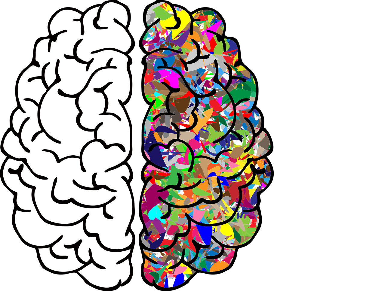
Color is a universal language that speaks to our emotions, influences our moods, and has the power to transform spaces. In the realm of home decor, understanding the principles of color psychology can be a game-changer. This article explores the fascinating world of color psychology and how it can be harnessed to create harmonious, inviting, and emotionally resonant living spaces.
Color is a universal language that transcends barriers and resonates with our emotions on a profound level. It has the remarkable ability to evoke feelings, memories, and even trigger physiological responses. When it comes to home decor, harnessing the principles of color psychology can truly transform your living spaces, making them not just visually appealing but emotionally enriching.
Understanding color psychology delves into the intricate dance between hues and human emotions. Warm colors like reds and yellows can stimulate energy, passion, and a sense of coziness. On the other hand, cool colors such as blues and greens can create feelings of calm, serenity, and expansiveness. By strategically incorporating these colors into your home decor, you can curate the emotional atmosphere of each room to align with its purpose.
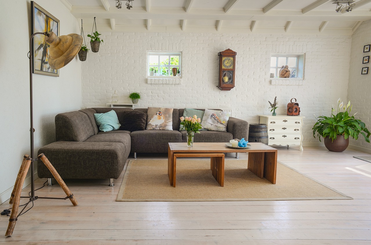
For instance, consider using soothing blues and greens in your bedroom to promote relaxation and restful sleep. In the living room, warm tones like earthy browns and welcoming oranges can encourage social interaction and lively conversations. The choice of colors on your walls, furniture, and accents can shape the overall ambiance and the emotional experiences of those who inhabit the space.
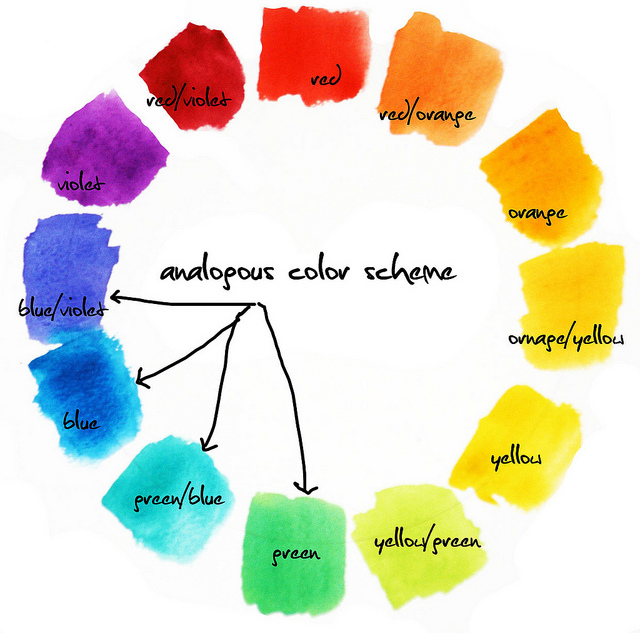
Beyond individual colors, color combinations also play a pivotal role in interior design. Complementary colors, like blue and orange, create dynamic contrast and energy, while analogous colors, such as various shades of green, offer a harmonious and calming effect. The balance between these combinations can evoke different emotions and set the tone for your living spaces.
Textures and materials can further amplify the emotional resonance of colors. Soft, plush fabrics in warm colors like red or deep orange can enhance the feeling of comfort and coziness. In contrast, cool-colored metallic accents like silver or chrome can imbue a sense of modernity and sophistication.
Moreover, color psychology isn’t a one-size-fits-all approach. Personal preferences, cultural backgrounds, and individual experiences can influence how colors affect us. Therefore, it’s essential to consider the specific needs and desires of the occupants when designing a space.
In conclusion, color psychology is a captivating realm that allows us to harness the power of color to create living spaces that are not just visually pleasing but emotionally enriching. By understanding the profound influence of colors on our moods and emotions, you can curate harmonious, inviting, and resonant environments that cater to the unique needs and desires of those who call your living spaces home. In doing so, you transform your house into a sanctuary that not only reflects your style but also nurtures your well-being and emotional connections.
Additionally, you can find further information on this topic by visiting this page: Color Psychology in Branding: The Persuasive Power of Color
The Influence of Color on Emotions
Colors have a profound impact on our emotions and can evoke a wide range of feelings. Warm colors like reds, oranges, and yellows can elicit feelings of energy, passion, and warmth, making them excellent choices for social areas like living rooms and dining spaces. Cool colors such as blues and greens are known for their calming and soothing effects, making them ideal for bedrooms and meditation spaces. Understanding the emotional responses associated with different colors is the first step in using color psychology effectively in home decor.
Color psychology is a powerful tool that can transform your living spaces into havens of emotion and comfort. Let’s delve deeper into how various colors can influence your home’s ambiance and help you create the perfect atmosphere:
Red: As a bold and energetic color, red is ideal for spaces where you want to stimulate conversation and activity. In the living room, it can create a lively and inviting atmosphere. However, use it sparingly as too much red can become overwhelming.
Orange: Orange radiates warmth, enthusiasm, and positivity. It’s an excellent choice for social areas like the living room or dining room, where you want to encourage lively interactions and a sense of togetherness.
Yellow: Yellow is associated with happiness, optimism, and energy. It can make small spaces feel larger and more inviting. Incorporate yellow accents or decor in the living room to create a cheerful and uplifting environment.
Blue: Blue is known for its calming and serene qualities. It’s a perfect choice for bedrooms and bathrooms, where relaxation and tranquility are essential. Lighter shades of blue promote a sense of peace, while deeper blues can add depth and coziness.
Green: Green represents nature, growth, and balance. It’s a versatile color that works well in various rooms. In bedrooms, it can create a sense of harmony and relaxation, while in home offices, it fosters concentration and productivity.
Purple: Purple is often associated with luxury, creativity, and spirituality. It can add a touch of opulence to spaces like the master bedroom or a meditation corner. Lavender shades are particularly soothing.
Neutral Colors: Neutral tones like beige, gray, and taupe are versatile and timeless. They serve as excellent backdrops for any room and allow you to play with colorful accents. Neutrals promote a sense of balance and sophistication.
White: White signifies purity, cleanliness, and simplicity. It’s perfect for creating an airy and open atmosphere. Use white in kitchens, bathrooms, and living rooms to enhance natural light and a sense of spaciousness.
Black: Black is a powerful and dramatic color. While it’s often used sparingly in home decor, it can add depth and sophistication to spaces like dining rooms or home theaters.
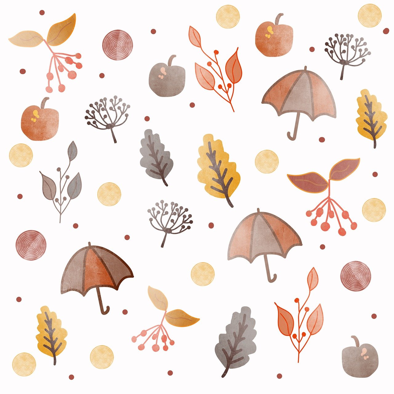
Earth Tones: Colors like browns, tans, and terracottas evoke a connection to nature and the earth. They can make a room feel grounded and cozy. Consider earthy tones in bedrooms, dens, or reading nooks.
Remember that color psychology is a highly personal experience, and individual reactions to colors can vary. It’s essential to consider your own preferences and the function of each room when selecting color schemes. Experimenting with different colors and their combinations can help you find the perfect palette that resonates with your emotions and creates a comfortable, harmonious living environment.
To expand your knowledge on this subject, make sure to read on at this location: Color and psychological functioning: a review of theoretical and …
Creating a Calm Sanctuary with Neutrals
Neutral colors, such as whites, grays, and beiges, are the foundation of many home decor schemes. These versatile hues provide a sense of balance and create a serene atmosphere. They serve as an excellent backdrop, allowing you to introduce pops of color through accents like furniture, artwork, and decor. The neutrality of these shades can promote relaxation and make rooms feel open and airy.
Neutral colors, with their timeless and adaptable nature, are the unsung heroes of interior design. Whites, grays, and beiges, among others, form the cornerstone of countless home decor schemes, offering a multitude of benefits beyond their visual appeal.
1. Timeless Elegance:
Neutral colors have an enduring quality that never goes out of style. While trendy colors come and go, neutral palettes remain timeless and sophisticated. This timelessness makes them a wise choice for long-term investments in furniture and decor. You can rest assured that a neutral foundation will stand the test of time, even as your tastes evolve.
2. Visual Versatility:
One of the primary advantages of neutral colors is their remarkable versatility. Neutrals provide a neutral canvas, allowing you to experiment with various design styles, patterns, and textures. Whether you lean towards minimalist, traditional, bohemian, or any other style, neutrals adapt effortlessly to accommodate your preferences.
3. Creating a Calm Oasis:
Neutral colors are renowned for their ability to create a calm and soothing atmosphere. They possess the innate power to calm the mind and promote relaxation. In bedrooms and living rooms, where serenity is paramount, the gentle hues of neutrals can encourage restful sleep and peaceful moments of reflection.
4. Enhancing Natural Light:
Neutrals are natural light’s best friend. They reflect and amplify natural light, making rooms feel brighter and more spacious. In spaces with limited sunlight, choosing neutral wall colors and furnishings can maximize the available light, creating a warm and inviting ambiance.
5. Unifying Design Elements:
Neutral colors serve as the great unifiers in home decor. They effortlessly bring together disparate design elements, ensuring cohesiveness in your space. Whether it’s blending mismatched furniture pieces or tying together a diverse collection of artwork, neutrals act as a unifying thread that harmonizes your decor.
6. Accentuating Textures:
The neutrality of these shades allows textures to shine. In a neutral room, textures become more pronounced and tactile. Whether it’s the cozy warmth of a plush rug, the roughness of exposed brick, or the smoothness of sleek furniture, neutral backgrounds accentuate the tactile qualities of various design elements.
7. Personalized Expression:
Neutrals provide a versatile backdrop for personal expression. They allow you to infuse personality and style into your decor through accent pieces. Whether you prefer vibrant artwork, colorful throw pillows, or boldly patterned rugs, neutrals provide a blank canvas that accommodates your unique tastes.
In conclusion, neutral colors are more than just a safe choice; they are a powerful design tool that can transform your home into a tranquil, adaptable, and timeless sanctuary. By selecting the right neutrals and complementing them with carefully chosen accents, you can create a living space that not only looks beautiful but also feels inviting and personalized to your preferences. The enduring appeal of neutrals lies in their ability to adapt and evolve with your changing design sensibilities, making them a dependable foundation for any home decor endeavor.
To delve further into this matter, we encourage you to check out the additional resources provided here: How To Use Color Psychology To Influence The Calming Mood Of …
The Elegance of Earth Tones
Earth tones, inspired by nature’s colors, have gained popularity in recent years. Browns, tans, greens, and deep terracottas bring the outdoors in and create a warm, grounding ambiance. These hues are associated with stability and comfort, making them a great choice for living rooms and dining areas where you want to encourage relaxation and connection.
The use of earth tones in interior design goes beyond just colors; it’s about embracing a holistic and harmonious approach to your living space. Here are some additional insights into incorporating earth tones effectively:
Natural Materials: Pair earthy colors with natural materials like wood, stone, and leather to amplify the connection to nature. Wooden furniture, stone countertops, and leather upholstery complement earthy hues beautifully and add a tactile element to your decor.
Biophilic Design: Earth tones align perfectly with the principles of biophilic design, which seeks to bring nature indoors. Incorporate potted plants, indoor gardens, or even a nature-inspired mural to enhance the natural vibe and overall tranquility of your living space.
Texture and Layering: Enhance the coziness of earthy color schemes by incorporating various textures and layering elements. Mix and match soft textiles like wool, cotton, and linen in your upholstery, throw pillows, and curtains. Consider a shaggy rug or textured wallpaper for added depth.
Balance with Neutrals: While earth tones are warm and inviting, it’s essential to balance them with neutral tones to prevent overwhelming the space. Use whites, beiges, or soft grays for walls, trim, and ceilings to create a harmonious contrast.
Natural Light: Emphasize natural light by choosing window treatments that allow sunlight to filter through while maintaining privacy. The interplay of sunlight and earthy colors can create a mesmerizing visual effect in your living room.
Art and Decor: Earth tones provide an excellent backdrop for art and decor inspired by nature. Consider botanical prints, landscape paintings, or nature-themed sculptures to reinforce the connection to the outdoors.
Accent Colors: To add interest and prevent monotony, introduce accent colors sparingly. Soft blues, muted oranges, or earthy yellows can provide a refreshing contrast without detracting from the earthy palette’s soothing effect.
Customize Your Palette: Earth tones are versatile and can be customized to your preferences. Whether you prefer warm, rustic terracotta or cool, forest greens, tailor the earthy color palette to reflect your unique style and vision for your living room.
Lighting Choices: Lighting plays a crucial role in showcasing earth tones. Warm, ambient lighting enhances the cozy atmosphere, while adjustable fixtures can highlight specific design elements and create focal points.
Furniture Selection: Choose furniture that complements the earthy theme. Natural wood finishes, rattan or wicker pieces, and upholstery in earthy shades or natural fabrics contribute to the overall aesthetic.
Cohesive Design: Ensure a cohesive design by carrying the earthy color scheme throughout the room, from wall paint and furniture to decor items and textiles. Consistency in color choices creates a unified and inviting living space.
By incorporating earth tones thoughtfully and holistically into your living room, you can create an environment that not only embraces nature but also promotes relaxation, comfort, and a sense of harmony. Earthy colors offer a timeless and enduring quality that can make your living space feel like a serene sanctuary.
You can also read more about this here: [Infographic] Colors that Influence Food Sales | Jenn David Design
The Vibrant World of Accent Colors
Accent colors are like the punctuation marks of home decor, adding excitement and personality to a space. When strategically placed, bold accent colors can create focal points and draw attention to specific design elements. For instance, a bright red throw pillow on a neutral sofa or a teal accent wall in a bedroom can inject energy and vibrancy into your decor while reflecting your personal style.
Accent colors are akin to the exclamation points or dashes in the narrative of home decor, injecting a sense of drama, flair, and individuality into your living spaces. They are the brushstrokes of personality that can elevate a room from ordinary to extraordinary. When employed with intention and finesse, bold accent colors possess the power to captivate the eye and tell a compelling visual story.
Strategically placed accent colors serve as visual cues that guide the viewer’s gaze and create focal points within a room. Think of a plush, vibrant red throw pillow adorning a neutral-toned sofa, like a jewel on a cushioned throne. The vivid contrast not only enlivens the space but also draws attention to the cozy seating arrangement, inviting relaxation and conversation.
In the realm of bedroom design, an accent wall painted in a striking teal hue can instantly transform the room’s character. This bold choice of color behind the bed becomes the pièce de résistance, the dramatic backdrop against which the entire room unfolds. It not only imparts energy and vibrancy but also reflects the unique taste and personality of the occupant.
The magic of accent colors lies in their ability to tell a story within the broader narrative of your home decor. They can evoke emotions, express your style, or pay homage to a cherished memory or place. A bright yellow accent chair in a reading nook might evoke the cheerfulness of a sun-soaked meadow, while a deep, moody burgundy accent wall in your dining room can convey sophistication and elegance, setting the stage for memorable dinner parties.
Moreover, accent colors aren’t limited to paint or upholstery; they extend to decorative elements such as artwork, vases, rugs, and even smaller details like tableware and cushions. These accents harmonize with the room’s overall color scheme while adding delightful surprises that engage the eye and spark conversations.
In conclusion, accent colors are the punctuation marks of your home’s design language, infusing it with personality and flair. They serve as visual cues, directing attention to key design elements and infusing energy and vibrancy into your decor. With a thoughtful approach, these bold hues can reflect your personal style, evoke emotions, and create spaces that not only look stunning but also tell a compelling story about the people who inhabit them. So, go ahead and let your decor speak with an exclamation point or a flourish of color – it’s your unique tale to tell.
You can also read more about this here: Interior Design: Understanding the Psychology of Color in Spaces
Creating a harmonious color scheme in your home is about finding the right balance between different hues. The 60-30-10 rule is a useful guideline
choose a dominant color (60%), a secondary color (30%), and an accent color (10%) to ensure visual balance. This approach can help you achieve a cohesive and aesthetically pleasing decor that resonates with your emotional goals for each room.
Selecting the right color palette is a pivotal aspect of interior design, and the 60-30-10 rule is an excellent guideline for achieving visual balance and harmony. Here’s how this approach can help you create a cohesive and emotionally resonant decor:
Dominant Color (60%): This is the primary color that sets the overall tone for the room. It’s the backdrop against which everything else will be seen. Consider the emotional impact you want to achieve. If it’s a living room, warm and inviting tones like earthy browns or soothing blues can be dominant. In a home office, serene grays or greens may promote focus and productivity.
Secondary Color (30%): The secondary color complements the dominant color and adds depth and interest to the space. It should harmonize with the dominant color and create a balanced contrast. For instance, in a bedroom with a dominant soft gray, a secondary color like muted lavender or sage green can introduce a soothing contrast.
Accent Color (10%): The accent color is your opportunity to infuse vibrancy and personality into the room. It should be used sparingly but strategically. Bold accent colors, such as a pop of fiery red in a neutral-toned living room or a vibrant turquoise in a predominantly white kitchen, draw attention and create focal points.
Here are some additional tips to make the 60-30-10 rule work effectively:
Consider the Room’s Function: Think about how the room will be used and what emotions you want to evoke. For example, a dining room may benefit from warm and inviting colors to encourage lively conversations, while a bathroom may lean towards calming and soothing tones.
Texture and Material: Alongside color, consider the textures and materials used in your decor. These elements can also evoke emotions. For instance, soft and plush textiles in a bedroom contribute to a sense of comfort, while sleek and glossy surfaces in a kitchen may promote modernity and efficiency.
Natural Light: Take into account the room’s natural light conditions. Colors can appear different under various lighting, so test your chosen palette in both natural and artificial light to ensure it maintains the desired emotional impact.
Personalization: Infuse your personal style and preferences into the color scheme. The 60-30-10 rule provides a framework, but don’t be afraid to add personal touches that resonate with you and make the space truly your own.
Test Swatches: Before committing to paint or large furniture purchases, test color swatches in the room. This allows you to see how the colors interact and how they make you feel in the actual space.
Ultimately, the 60-30-10 rule is a flexible tool that can guide you in creating a balanced and emotionally appealing decor. It’s about achieving the right proportions and making conscious choices to ensure that your home not only looks good but also feels harmonious and suits your emotional goals for each room.
To expand your knowledge on this subject, make sure to read on at this location: Color Theory Basics: How To Use Color Theory For Interior Design …
Personalizing Your Space
Ultimately, the power of color psychology in home decor lies in its ability to personalize your living spaces. Your home should reflect your personality, preferences, and lifestyle. Experiment with different colors and combinations to create a space that not only looks beautiful but also feels right for you. Remember that color is a dynamic and versatile tool that can be adjusted to suit different moods and seasons.
Ultimately, the power of color psychology in home decor extends beyond aesthetics; it’s a means of crafting living spaces that are deeply personal and reflective of your inner world. Your home should be a canvas for your personality, preferences, and lifestyle, a place where you can truly be yourself. Here’s how color psychology empowers you to achieve this personalization:
1. Reflecting Your Personality:
Your home is an extension of your identity. The colors you choose should reflect your unique personality traits and values. For example, if you’re an outgoing and energetic individual, you might gravitate towards vibrant and bold color schemes, while those with a more tranquil disposition may lean towards softer, cooler tones. By aligning your decor with your personality, your living space becomes a genuine reflection of who you are.
2. Evoking Personal Memories:
Colors have the remarkable ability to evoke memories and emotions. You can leverage this aspect of color psychology to infuse your living spaces with personal significance. Incorporate colors that remind you of cherished memories or places you hold dear. These hues can serve as a source of comfort and nostalgia, making your home a deeply sentimental space.
3. Aligning with Your Lifestyle:
Consider your daily routines and lifestyle when selecting colors for different rooms. If your living room is a hub for social gatherings and relaxation, warm and inviting colors can set the mood for conviviality. On the other hand, if you require focus and productivity in a home office, cooler and calming hues can enhance concentration. Tailoring color choices to your lifestyle enhances the functionality of each room.
4. Experimentation and Self-Discovery:
Color psychology invites you to embark on a creative journey of self-discovery. It encourages experimentation with different colors and combinations to find what resonates most with you. You might discover hidden preferences or develop an appreciation for colors you hadn’t considered before. This process of exploration and self-expression can be both exciting and fulfilling.
5. Adapting to Changing Seasons and Moods:
The dynamic nature of color allows you to adapt your living space to changing seasons and moods. As the seasons shift, you can introduce new color accents that reflect the external environment. In the spring, pastels can usher in a sense of renewal, while warm autumnal hues can evoke coziness in the fall. This adaptability ensures that your home remains in sync with your ever-evolving emotional landscape.
6. Creating a Sense of Ownership:
Choosing and implementing colors in your home decor can instill a profound sense of ownership and pride in your living spaces. It becomes a creative endeavor that empowers you to shape your environment according to your vision. The process of selecting colors, arranging decor, and witnessing the transformation can be deeply satisfying and personally fulfilling.
In sum, color psychology in home decor is a versatile tool that allows you to personalize your living spaces in profound ways. By aligning your color choices with your personality, memories, lifestyle, and even the changing seasons, you create a home that not only looks beautiful but also resonates with your inner self. It’s a powerful means of self-expression and self-discovery, turning your living space into a unique and deeply personal sanctuary that truly feels like home.
To expand your knowledge on this subject, make sure to read on at this location: Interior Design: Understanding the Psychology of Color in Spaces

Conclusion
The power of color psychology in home decor cannot be underestimated. It offers a means of expressing emotions, creating harmonious environments, and personalizing living spaces. By understanding the emotional impact of colors and applying this knowledge thoughtfully, you can transform your home into a haven that resonates with your unique style and fosters the desired mood in each room. Whether you seek relaxation, creativity, or energy, color psychology is a versatile and inspiring tool at your disposal.
Color psychology is a fascinating facet of interior design, and it indeed wields immense influence over the ambiance and atmosphere of your home. Here are some key considerations to help you harness the power of color psychology effectively in your decor:
Color Families: Colors can generally be grouped into warm (reds, oranges, yellows) and cool (blues, greens, purples) families. Warm colors tend to evoke energy, passion, and coziness, while cool colors often create a sense of calm, relaxation, and spaciousness. Consider these families when choosing color schemes for different rooms based on their intended functions.
Room Functionality: Each room in your home serves a different purpose, and the color choices should align with those functions. For instance, warm and vibrant colors like red or orange can be invigorating in a kitchen or dining area, while cool and soothing blues work well in bedrooms for a peaceful night’s sleep.
Neutral Foundations: Neutrals such as white, beige, and gray provide versatile and timeless foundations that can be complemented with accent colors to set the desired mood. Neutrals also create a sense of balance and allow you to experiment with bolder color choices in decor and furnishings.
Accent Colors: Accent colors can inject personality and character into your decor. Use them in moderation to highlight specific features or areas of a room. For example, a single wall painted in a bold color or vibrant furniture pieces can serve as striking accents.
Consider Lighting: Natural and artificial lighting can significantly affect how colors appear in a room. Test your chosen colors under various lighting conditions to ensure they convey the desired mood consistently.
Personal Associations: Your personal associations with colors should also guide your choices. Colors can trigger memories, emotions, or cultural symbolism. Be mindful of how a color resonates with you and the messages it conveys.
Balance and Harmony: Strive for a balanced and harmonious color palette in your home. While experimenting with different hues and shades is encouraged, maintaining a sense of unity through a cohesive color scheme helps create a pleasing and inviting environment.
Texture and Pattern: Don’t forget to consider texture and pattern in your decor. Combining different textures and patterns can amplify the emotional impact of colors. For instance, soft, plush textures in warm colors can enhance the cozy feel of a room.
Transition Spaces: Use color to guide the flow of your home. Transition spaces, such as hallways and entryways, can be adorned with colors that complement or contrast with the adjoining rooms, creating a sense of continuity or separation.
Experiment and Adapt: Don’t be afraid to experiment and adapt your color choices over time. As your tastes and needs evolve, so can your home’s color palette. It’s an ongoing creative process that allows your living space to grow and change with you.
Incorporating color psychology into your home decor is a dynamic and fulfilling endeavor. It empowers you to craft a living environment that not only reflects your personality but also elicits the emotions and experiences you desire. By applying color psychology thoughtfully, you can transform your home into a personalized haven that resonates with beauty, harmony, and emotional depth.
To expand your knowledge on this subject, make sure to read on at this location: Color Psychology: How Color Affects Your Emotions And Why
More links
To delve further into this matter, we encourage you to check out the additional resources provided here: The Psychology of Colors in Interior Design | Foyr